here's how I got started...

here's how I got started...
a 20 minute podcast by Crazy BeYOUtiful

Monday, February 28, 2011

papered...clearly for art...

Happy Monday & last day of February...
FINALLY!
I HOPE spring is right around the corner...

today I wanted to share a fun project, using clearly for art, patterned paper & Ranger's new Glue N Seal...

I LOVE the look of patterned paper flowers, but since my art is shipped all over the country, I want it to be as strong & durable as possible...

squished flowers do not make me happy...


now it's simple to create lightweight sturdy embellishments...

the 3 patterned paper flowers on the piece below were made
combining paper with clearly for art...


ok...ignore the paper on the flower below...
I made quite a few flowers, but haven't used these just yet...

if you want to play...
grab some clearly for art...
Ranger's new Glue N Seal and some patterned paper...
I chose some from tim's lost & found paper stash...

this is a good time to use up small scraps of both clearly for art & patterned paper...
the smallest flower from
tim's tattered florals die is perfect for mini scraps...

start with a piece of clearly for art,
large enough for the flower you are making...

paint a thin coat of Glue N Seal onto the clearly for art
& then cover it with the patterned paper...

I like to use a brayer to make sure
it's stuck down really well...

lay the paper covered clearly for art (aka CFA)
on your craft sheet & heat to dry...
I heat it a bit on both sides...

for the large flower on the project I stamped this flower onto the paper side, using jet black archival & cut it out...

by cutting both layers @ once, the edges are perfect...


for the back of the flowers
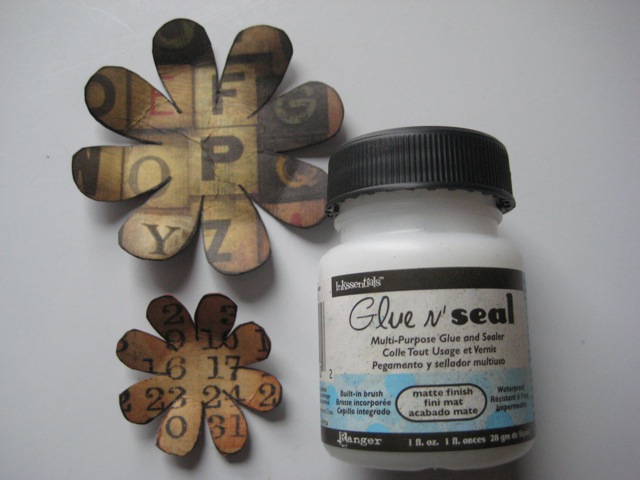
I stamped text, using jet black...

the Glue N Seal dries nice & clear...
so...
here's plan b...

I could use the back side & ink it with alcohol inks...
but that's a project for another day...
keep that option in mind...

sorry about the glare from the window...
but it helps to show that the back is CFA...


below is the finished piece with a different scrap of lost & found paper over the CFA...

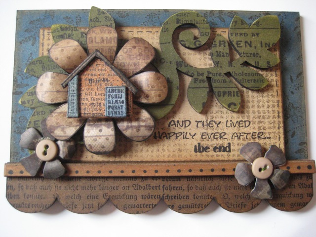
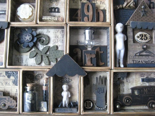
the base is the base from the rectangle art parts frame...
it's inked with weathered wood distress stain & then the edges were inked with walnut stain distress ink, using the blending tool...

the background was stamped with coffee archival...

the insert from the rectangle art parts frame was covered with paper from tim's lost & found pad...
and stamped with this background,
again using coffee archival...

the art parts scroll/leaf piece was inked with meadow color wash & stamped with jet black archival &

the large flower was stamped with
the polka dot background & coffee archival...

the saying is stamped in jet black & POPS when stamped over the coffee background...
I rarely use black for background stamping...
I save it for my main images...

the mini house was stamped on grungeboard 2 times...
I cut out one full image & parts of the second one to layer...

the house is rusty hinge distress ink & the accents are stormy sky distress ink...

the large art parts scallop was inked with
stamped with black & this text stamp...

the extra trim strip is a straight flower stem,
trimmed to fit & inked with rusty hinge...
it's stamped with jet black & the polka dot border...


and the buttons are threaded...
I HATE naked buttons...

if you've been in a class of mine...
you certainly know that...


and since I was having a blast
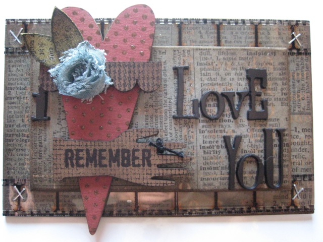
making CFA patterned paper flowers...
I made this red one...

the stain is applied to a scrap of a dictionary page...
which was glued to a piece of CFA...

the new art part bookplate makes a cute easy hanging piece...
great for a quickie gift...

I layered it over an art parts ATC...

the ATC was misted with denim color wash...

I embossed polka dots over the book plate with clear UTEE,
then the bookplate got inked with peeled paint distress stain...
because I embossed over the naked art part,
which is kraft colored, the embossing looks brown...

a vintage button over a sprocket gear makes the flower center...

add a couple leaves...

and a saying...
DONE!


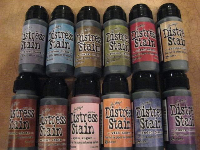
can you see how color washes, distress inks & the new distress stains all work together so well?

think that was planned??
YOU BET!

to answer a few questions about the Glue N Seal...
I'm using the matte finish for my projects above...

it comes in the same size bottle as tim's crackle paints...
it has the same brush, which makes for NO messy cleanup!
I LOVE THAT!

you can refill the little jar with this larger size (NO brush)...

it's thinner than Claudine's multi medium...

I use the multi medium
when I want to glue a small piece
& I know the brush would be too large...

the mini multi medium bottle is perfect for detail pieces...
because the tip is fine...

both products hold even the heaviest of embellishments...

both are waterproof, when dry...

so keep that in mind if you get it on your clothes...
it's waterproof...

you can clean it off your hands
when it's wet with soap & water...
but if it dries on your hands...
you'll need to peel it off...

it's waterproof...

if you need to seal an alcohol inked project ...
something that will get handled lots...
brush over the alcohol ink with Glue N Seal...

talking about these cool products
make me want to run to the studio to...

make art!
wendy
ps...making papered clearly for art embellishments is fun...
wait till you see what's coming next for CFA...
a whole different look when combined with some Ranger goodies...
I discovered this yesterday...
like?
soon...

Friday, February 25, 2011

art brings to life...

what the mind can only imagine...

happy weekend friends!

as promised...
here's a fun little project using some of my fav products...

clearly for art (aka...CFA)...


tim's adirondack color washes...

Ranger's Adirondack pigment inks...
some stamps...
and more...

I'll show you how to make this...


sometimes I don't want my (clearly for art) CFA pieces to be clear...
but I do want the embellishment to be strong & unbreakable...

there are several different ways to change the look...
from clear to opaque...
today I'll show you how to use pigment ink...

start with a piece of CFA...
the size is determined by what you are stamping...

this is a good way to use up scraps...
this mini butterfly is perfect...

ink the CFA by tapping the Adirondack pigment pad onto the surface of the CFA...
I used butterscotch for the butterfly...

lay it on the craft sheet & dry with the heat it tool...

apply a second layer of color with the pigment pad...
then dry again...

ink the butterfly with jet black archival
& stamp onto the butterscotch inked CFA...

dry again...
so the image doesn't smear...

then cut out the image...

because the pigment inks are opaque,
if you heavily apply the pigment ink over the stamped image it would cover it up...

you can get a very clear crisp image by inking the surface first...
then stamping...
with jet black archival...

now lay the butterfly back on the craft sheet...
heat until it softens, then pick it up & shape it...

don't like it?

lay it back on the craft sheet & heat it again...
and again...
and again...
clearly for art goes completely flat every time...

shape it until you are 100% happy...


the background was really fun...
I covered the art parts base with this manila card stock
it's the same clay coated material as the tags,
but it now comes in larger pieces for larger backgrounds...
it's a great durable surface...

it's lightly misted with red pepper, sailboat blue, lettuce & butterscotch color washes...

dried it...
then over stamped it using coffee archival with the circle background...

I distressed the edges with walnut stain distress ink & the blending tool...

were stamped with jet black...

the tiny attacher holds the film strip ribbon in place...


and a closer look...
the colors blend & look great!


next...
the heart was inked with barn door distress stain & then stamped with my fav medicine label, using jet black...

I lightly sanded the edges with the sanding grip & added a bit of walnut stain with the blending tool...

the scroll/leaf art part was inked with meadow color wash, dried & stamped with this background, using olive archival...

the mini art parts flower was inked with faded jeans...


now just assemble the pieces to look like this...
don't forget the spider!

and add a foliage leaf under the mini flower...


the new distress stains & color washes are both PERFECT for laying down the base coat of color on art parts...
it's VERY fast & oh soooo easy...

I always blast them with the heat tool to dry...
after inking them...

then just go back & add distressing to the edges with the blending tool & distress ink...


STOP THE PRESS!
I just got an email from Heidi that the NEW STAMPS, NEW ART PARTS & Clearly for Art BLACKOUT have arrived.

and...
Preorders have shipped...

YIPPEE!!!

THANK YOU TED & Michelle &
all the folks @ STAMPERS ANONYMOUS...
we appreciate your hard work & quick shipping...
CHA was less than a month ago!
AWESOME!

have a wonderful weekend...
I plan to...

make art!
wendy

Tuesday, February 22, 2011

wondering & winners...

I WONDER what triggers art ideas...
where do they originate from?

take for instance...
the other morning when I woke,
I was WONDERING if the roof
from the largest art parts residence
could be transformed into a party hat...

WONDER why that idea was brewing?
was I dreaming of something?
I seriously have no clue...

but...
I LOVE when things can be used in several ways...
so maybe that was in the back of my mind...

the idea worked...
and the hat now sits on this cute art parts head...
which is a perfect fit for

which is sporting new eyeglasses...
compliments of tim's sprocket gears...

the party hat is embellished with an art parts scallop trim...
which holds the new hanger clip...
reminds me of Minnie Pearl...ha!

the head is attached to my new art parts dress form...

which is embellished with grunge wings...

& then stamped with jet black archival ink...

the butterfly is the new clearly for art "blackout"...
LOVE IT!

the party hat idea turned into this...


look inside & exhibit A are from this stamp set...

the flower & the flower center are from this set...

a trinket pin adds some interest behind the flower...

Cut N Dry nibs make it simple to color small areas...
like her lips...

she's tall @ a whopping 9 1/2 inches...

here's a closeup...
it was fun discovering unexpected "art parts" combos...


A MILLION thanks for all the AWESOME comments from the last post...
You have made me happy!

I've heard that the "butt roll" story
was told in tim's UK classes...
too funny!

I think the Ranger designer challenge
shows PERFECTLY (get it? perfectly?)
that Perfect Pearls work with any & EVERY style...
you have a MILLION choices how to use them...

the challenge was really fun...

and speaking of fun...
do you WONDER who the WINNERS are??

Rick has been busy...

here we go...
shoot me an email if you are a winner (wbv1213@me.com)

donated by Ranger are going to live with...

lesleyworth said...
fabulous piece of art! love all the antique elements! and the espresso with heirloom gold...definitely going to have to try that out!
February 18, 2011 9:31 PM

and then he popped over to the Ranger blog & chose this comment to win book #4...

Wow, these are all so cool. I love all the designers........they each have their own special talent.

again we thank you for all the comments...
Rick & I both enjoyed reading them...

coming later this week (I hope) is a little something more with the Adirondack Color Washes...
and a few art parts...
and some of the new distress stains mixed in too...

or maybe a new twist on "clearly for art"?
that is cool too...

I've been in the studio...LOTS!

stay tuned...
until then...

stay warm...
and...

make art!
wendy
ps...one more thing...
about those hitch fasteners...
if you don't have them...
you just might WANT/NEED some...
I have a very fun project in book #4, which uses 5 of them in a unique...
fun way...
just saying...
best to be prepared...

Friday, February 18, 2011

how about some Ranger fun?

ok...due to some questions/emails...
I have to finish the story about yesterday's post...
this concerns Lady Dy...

while the Ranger booth was being set up @ CHA,
Lady Dy was working on her art journal...

she mentioned something about looking for her "kitchen roll".

DUH...
I thought she was hungry & told her the Ranger guys always bring us snacks...

but, little did I know that Lady Dy was referring to...
a roll of paper towels!

so that became our standing joke for the entire CHA...
we laughed about kitchen rolls...

because of the blizzard in Chicago,
I was delayed for a day coming home from CHA
& had plenty of time to think...

I got to wondering what she called toilet paper...

so I emailed & asked...

her response...
"why toilet paper of course.
what did you think we'd call it?"

my response...

a butt roll...

kitchen roll...
butt roll...

made perfect sense to me...

so if you've seen the bantering back & forth
on Facebook & Twitter about the "shimmy butt roll"...
that's the story & I'm stickin to it...

I have some quite lovely normal British friends...

and there's Lady Dy!

I LOVE her dearly!
she makes me laugh...

moving on...

here's my designer challenge for Ranger...

it's featured on Ranger's blog today...
if you've not visited there this week, scroll down & see all 20 creations...

we were each given a 12 x 12 wood frame with a black foamcore insert, Perfect Pearls and more Ranger goodness...

our mission was to create art within the frame
& to feature Perfect Pearls...
I started by adhering a giant vintage dictionary page to grungepaper...
I applied the adhesive randomly, so that when I misted it with water & heirloom gold Perfect Pearls mist the dictionary paper would buckle & look really dimensional...

I tore several spots & curled them...
for more texture & a vintage effect...

I misted the wood frame with espresso color wash & spread it with a piece of Cut N Dry foam...

the color washes are great on unfinished wood...
very quick & simple...

& then I randomly stamped my fav medicine bottle stamp, using jet black archival...
I finished the frame by misting it with heirloom gold Perfect Pearls mist...

when I misted the entire piece with heirloom gold Perfect Pearls mist...
I held the frame upright to create drips of shimmer on the paper...
sad to say the photos don't show the pearls...

you'll see lots of art parts...
like the star border, guys & the large truck...
those were stamped with jet black archival...

the book is a vintage book from an antique mall...
the vintage glasses were found there too...

I glued the book shut & wired it to the foamcore, so it would be nice & sturdy...

tim's trimmings ribbon was misted with espresso color wash & heirloom gold Perfect Pearls mist & then stamped with text, using jet black archival...

I LOVE the combo of espresso color wash & heirloom gold PP...

oh...that vintage pen nib was an antique mall find too...

here's my piece...


here's a closer shot of the book & glasses...


and here's a really close look @ the flower...
it's die cut from my new Clearly for ART BLACKOUT...
using tim's tattered florals die...

then it's stamped with my polka dot background & the plaid background too...
using the gold paint dabber for both...

tim's giant accoutrement bling button made the perfect center...
I LOVE it especially with BLACKOUT...


Now about that giveaway...

I promised to suck up to the Ranger guys...
tim, Alain & Justin @ CHA...
and it worked!

I'm happy to report...

SUCCESS...

I scored these...

I have 12 BRAND NEW tim holtz distress stains to give to a lucky someone...

they are just...
AWESOME!


just leave a comment for a chance to win the stains...
it's as simple as that!

I will have Rick choose the winner @ 7am on Tuesday...

but...
wait there's MORE...

want an advance copy of my newest book...#4?

THANKS to Ted & Michelle for giving me an extra copy to give to one of you...

to enter you just need to

then @ 7:02...on Tuesday morning,
I'll have Rick choose a winner
from the comments over there...
(he'll be busy here @ 7am)...

so, a comment here is your entry for the set of stains...

if you'd like the book...
just leave a comment

2 entries...
2 chances to win...

good luck!

have a wonderful inky weekend...

and take time to...

make art!
wendy
PS...HUGE THANKS TO tim, Alain, Justin, Ted & Michelle for the goodies!

and speaking of Ted...
he's in Columbia South Carolina this weekend

stop by & visit with him...
SHOP in the AWESOME brand new BLACK booth...
and tell him I said HI!
his demo will entertain you...
FOR SURE!

Thursday, February 17, 2011

inspired to play...

from the moment I first saw Dina Wakeley's work...
I was in awe...
it's so unique & it's just plain inspiring...
it makes me smile...

then there's my counterpart in the UK...
she's the UK senior educator for Ranger...
the REAL LADY DY...

I watched her @ CHA...
she just plays...
she sprays journal pages with no idea
(or so she says) of where she's headed...

then she collages "funky" images from magazines
on her journal pages...

I was inspired...

so, I took a break from scheduling & supply ordering...
and inspired by these 2 awesome talents...

I played with tim's newly redone Adirondack color washes...

since this is not my "normal" style...
my first thought was that if they turned out ugly,
I'd trash them & no one would know...

and I'd certainly NOT tell you about them here...ha!

but honestly...
I had a BLAST...

I started by covering 6 x 6 manila cardstock with a dictionary page & went from there...

I like having the option to make backgrounds larger than tag size...
thus the manila cardstock as the base...
same wonderful clay coated material as the tags,
but in a larger size...

I had a very hard time not adding any dimension...
(aka art parts)
but my plan was to just PLAY
and see what cool backgrounds I could create to stamp on...

so I got out tim's color washes & just started spraying...
with no clue how they would turn out...

butterscotch & meadow for these 3 pieces...

mine look nothing like theirs...
which is good...
my idea was to be inspired...

copying is NOT good...

here's the first page...
studio 490 style...
LOVE the stars!


and this just might be a class using my new art parts creative covers with tim's ring binders...
maybe??? still thinking...

on a side note...
...the LUCKY gals in the UK are doing a class with tim TODAY using the creative covers!
I'm thrilled & EXCITED to see their creations...


stressed & NEEDING some retail therapy!


I've said here many times that I LOVE mini...
but...sometimes it's true...

BIGGER is better!

Take for instance Ranger's new MISTER...
I LOVE it because it holds lots of water...
for inky techniques...

the misters are also good for mixing larger quantities of custom colors...
think Perfect Pearls & distress re-inkers...
the bottle is 2 ounces!

if you have the older color washes, you can easily pour them into the new misters...
the color washes are the same...

the new mister is the same as the spray bottle that the color washes come in now...
perfect!
now it's easy to USE up those color washes...

now scroll back & look @ the photos again...
do you see that the color washes look chalky
& not transparent?

I had this *idea*...

I used the new mister filled with water
& added about 1/2 of a snow cap white pigment re-inker...

let me just say this...
FLIPPIN FUN!

by adding this one secret ingredient, you can totally change the effect of the normally transparent color washes...

I see a new addiction coming on...
seriously...

NEWS FLASH...
come back tomorrow...
I have something special planned for you...

I *think* it involves a giveaway...
that's what I *think* anyway...

until then...
make art!
wendy

Monday, February 14, 2011

with LOVE from me to you...

Happy Valentine's DAY to you!!!

I have a little video to show you...
but first some thoughts...

or disclaimers!

it's NOT perfect...

it's not edited...
I'm lucky I figured out this much...

so DON'T LAUGH...
I tried!

I had a big DUH...
the tripod was in my way so I moved it,
which changed the orientation of the screen...
so that explains the skinny size...

DUH...
lesson learned...

here's the completed project...
it features my new art parts heart, hand & mini scallop...

the background is tim's new kraft resist paper...

the letters are his new alpha parts...

forgot to show that in the video...
another duh...

the film strip ribbon was added to the art parts base with the tiny attacher...


and the video...

I HOPE it works...
otherwise there will be a quick "DELETE POST"...


I hope that you can see how beautiful the weathered wood distress stain looks on art parts...

and how cute the little trimmings flower looks...


Have a GREAT DAY my friends!

CHEERS!
Here's to LOVE...
and

mak(ing) art!
wendy

***EDITED AFTER VIEWING***
YIKES......it's kind of small...
I can make it full screen...
I hope you can too...
if not...I hope you have a magnifying glass!
next time will be better...
I HOPE!

Friday, February 11, 2011

idea-ology print tray...

grab a beverage...
this could be a long post...

this was my most favorite CHA project...
ever...
OK...@ least for today...

I LOVE it because it's LOADED with my art parts & LOTS of idea-ology goodness...
both new & current...

I started by misting the outside of the print tray with espresso color wash...
& then spread the color around with a piece of cut N dry foam...

then I edged each little compartment with the gold paint dabber and lined each compartment with tim's papers...
some are from the lost & found paper stash...
and some are the new (YUMMY) crowded attic stash...

here's a look @ the whole print tray...

ink & make 490 art...

the letters are tim's cool grunge blocks...
LOVE LOVE LOVE them!


starting @ the top left...

I distressed tim's new plaquette with coffee archival ink to make it look really old...

it's attached to an art parts scallop...
sized to fit configurations...

(I did 3 new sizes, so there's something to fit the current configurations...PERFECTLY....)

the ink bottles are art parts with coordinating stamps...

the mini flower is a new art part & I used just half of the scroll/leaf art part...
tim's mini star is stamped on a
cutout from the spools package...

#55 was inked with jet black archival to easily change the color of the number...

the "make" compartment houses a new nib...

and the bottom right is my FAVORITE accoutrement button layered over a new one...


I flippin LOVE the art parts pocket watch...
and I have an idea that's brewin...
can't wait to try it...

the pocket watch is painted with the gold dabber & accented with jet black & coffee archival to tone it down a bit...

the inside is a perfect fit for a 2 inch circle punch...
so I stamped my new medicine label on a scrap & punched it out...

I stamped the flower (using the gold dabber) onto Clearly For Art BLACKOUT...
and layered it with some foliage...

the hanger clip is just soooo stinkin cute...
the photo is a mini from the lost & found paper pad...


new stuff in the photo below...
the moth is cut from tim's crowded attic paper...
the "m" is an alpha part...
the numbers inside the corked vial are cut from a calendar in the lost & found papers...


the nib made a good butterfly body...
the butterfly is stamped on BLACKOUT...

the "art" compartment is supposed to look like an envelope...
I cut a piece of felt to look like a flap & added an accoutrement button for the closure...

the mini truck is an art part with a coordinating stamp...


here's the other half of the art parts scroll/leaf...

the light bulbs are sooo fun to hang...

the new art parts scallop corner makes a good roof...
in addition to a corner...

the fractured doll is adorable...
this is the mini one...

proprietor is from the medicine label stamp...
it's stamped on a section of the straight flower stem...

I LOVE the mini art parts hand...
it's stamped with the mini "OPEN" stamp...
I made a bracelet with the ball chain...


more art parts scallops...
and part of an art part residence...


oh...and here's the large art parts truck with coordinating stamp...


and a closer shot of the large truck...
this time I accented the truck with some hitch fasteners...
a snap & added a mini face peeking out the window...
"contents" is a portion of this stamp...
the corner was a good fit...


here's the new heart...

dried it...
and then stamped on it with jet black archival...

the hanger clip fit perfectly on the hitch fastener...
"h" is an alpha part...


after each compartment was complete, I glued them right to the tray...

everything was glued with either Glossy Accents or Claudine's multi medium...

it's large...about 12 x 16...

I think it's a great project, even if you only have small increments of time to create...
oops...make art...

just complete a mini collage in each compartment
& before you know it...
it will be complete & ready to hang...

I have to say that making the tray was so much fun...
I really was sad when it was finished...
can't wait to get it back & hang it in my studio...

and speaking of studio...
what's in the box?


because I'm storing them in the box upright, I added little color swatches to make it easier to grab the right color...

I just dabbed each stain on a manila tag, punched out a 1/2 inch circle & glued it to the lid...

they are in the box...
for easy access, right on my workspace,
because I WILL be using these guys every day!

for sure...
I totally LOVE them...

and...

GET THIS!!!

they have shipped & are in stock...here!

yippee...
THANKS to Ranger for getting them shipped out so quickly...
they're awesome!


next...
Simon Says filmed a video about my "Clearly for ART" products...


I tease Rick because he talks with his hands...
ALL THE TIME...

after watching this video...
I think it's best to not tease him anymore...
just saying...
tie my hands & I probably can't speak either...

AND...

if you happen to be in the Clearwater, Florida area
on Saturday...
pop over to STAMPFEST...

visit with Ted...
watch him demo...
be entertained...

see the AWESOMELY COOL
BEAUTIFUL BRAND NEW BOOTH...


Ok...
I think I covered everything...

I wish you a WARM wonderful weekend...

may you be inspired to...

make art!
wendy
ps...I better make a valentine for my sweetie...

Thursday, February 10, 2011

boxed & READY...***SOLD OUT***

15 giant priority boxes are stuffed & ready for new homes...

each has approximately 100 sheets of paper...


LOTS of random goodies...


several bags stuffed with alphabets, frames, numbers & MORE...
surprises...


Each box is $40.00 plus shipping...

Rick took 2 to the PO yesterday to determine the shipping fee...
these are HEAVY...
even heavier than we thought...
YIKES...
like 8 pounds...

so, USA shipping with delivery confirmation is $19.65

that makes the total $59.65 each box...

If you NEED one
& promise to give it a good home
& USE the contents...
to make art...

email me @ wbv1213@me.com

I will send you a PayPal request
for the total which is $59.65
THANKS!!!
THESE ARE ALL SOLD...& they will ship TODAY!

I've had lots of requests for more photos of the CHA sample using tim's new configurations print box...

I'll be back tomorrow with some close-up shots for you...

until then...

make art!
wendy